ENZZO · PART 1 OF 3 · AUG 2024 TO NOV 2026
First-run experience
How a new person gets from sign-up to a first result in Enzzo: the front door, the navigation and the onboarding tours.
Role
Product Designer: research, interaction design, UX writing
Duration
Aug 2024 to Nov 2026
Team
CEO, CTO, product and four engineers.
At a glance
Problem
In trial accounts without a guide, 40% to 67% of people gave up creating a workspace.
Change
I kept the structure, rewrote the words in plain language, asked one question at a time, and gave each type of output a permanent home in the navigation.
Result
The front door and navigation shipped in August and September 2026. For the client it was built for, 11 of 12 completed it (92%), up from 17 of 20 (85%). Overall completion stayed flat.
My part
The audit, the screens with their copy and error states, and the tour cleanup, which is built and in review.
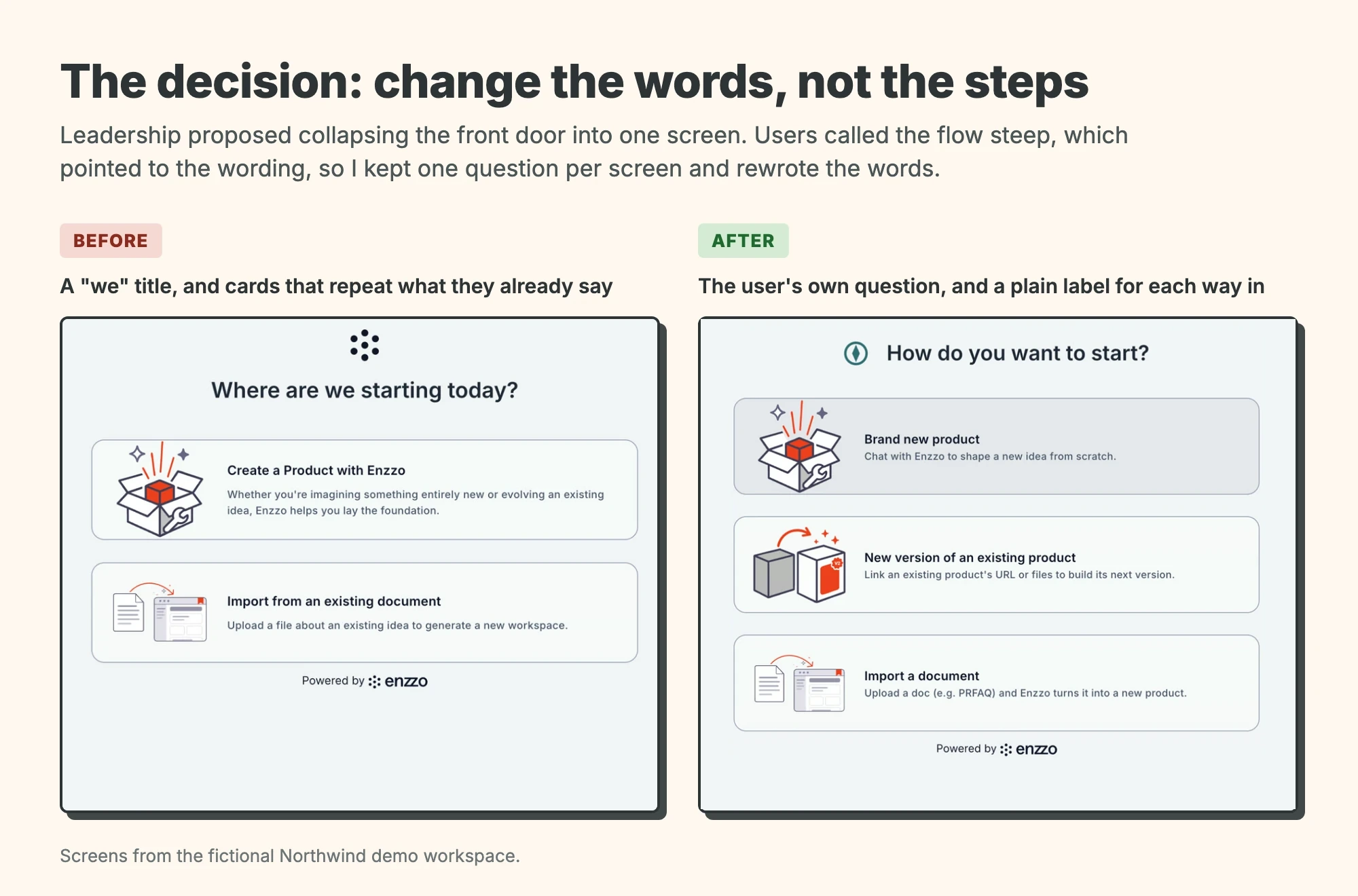
The decision: change the words, not the steps
Leadership proposed collapsing the front door into one screen. Users called the flow steep, which pointed to the wording. I kept one question per screen and rewrote the words.
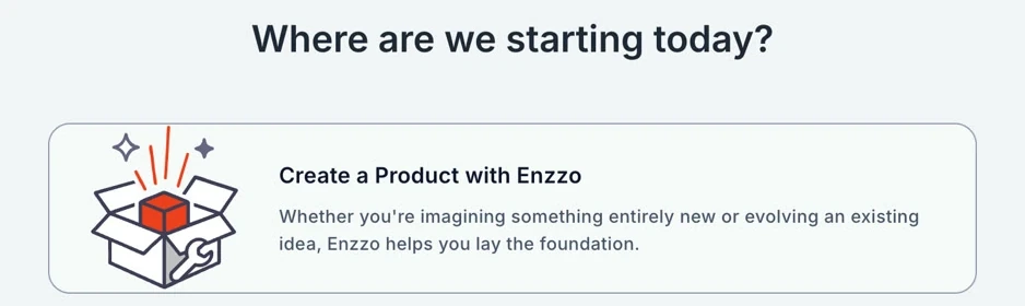
Before
A "we" title, and cards that repeat what they already say
After
The user's own question, and a plain label for each way in
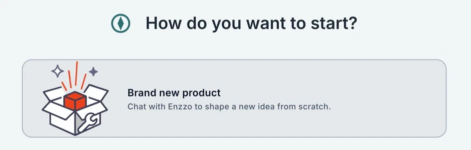
Tap a screen to expand it.
One decision, side by side. Screens from the fictional Northwind demo workspace.
When I joined Enzzo, a new person had to get through at least seven screens of chat before a workspace even existed, and many of them never did. In the trial accounts I looked at, 40% to 67% gave up. This is part 1 of my Enzzo case study: the front door I rebuilt, the navigation behind it, and the tours that were meant to help.
Every screen and video here comes from a demo workspace with invented products, people and numbers, so none of it is client data.
Why people gave up
Before I changed anything I analyzed four trial clients (anonymized). Abandonment at the front door was 40% to 67% in ungated clients and 17% in the gated client. Many people started the front door and never reached the workspace view, because they thought the chat was all Enzzo was. I judged that the words were the problem: titles used "we", labels named internal tiers instead of user actions, and descriptions repeated the labels.
The front door
The decision above started here. People dropped out of workspace creation. At first we kept adding small fixes. Then I wrote a full audit of why people were not finishing, and after that leadership was on board with changing the front door. After feedback from a client, leadership proposed one screen with three options, plus monitoring. I tested that against the evidence and answered with a written review. It kept what worked, like the split between quick scoring and deep development and descriptions that lead with the outcome, and changed the rest with a reason for each.1
I inherited a long chat: at least seven screens before a workspace existed. This is how the front door changed.
The front door in three eras, in 47 seconds: the long chat I inherited, the one-question-per-screen steps, and what shipped in August 2026, with no chat.
Getting from the long chat to the shipped flow meant turning down several things. Engineering told me import and create need different prompts and different code, so import stayed its own card, the one time an engineer's pushback changed the design. One screen with three options would have moved the confusion further in, because quick review and full assessment are different starting points. Monitoring left the creation flow because someone who clicked New has already decided to create something. "Pipeline", "Quick Access" and "In-depth Access" became "Quick review" and "Full assessment", and titles that said "we" were rewritten. I also did not let people pick their client's process name: two programs run the same flow under different names, so the system shows the label for the user's organization.
Try it: click New Product, then answer the three questions one screen at a time and land on the gate overview.
It shipped and clients used it, and I improved it from their feedback. Every screen is documented with copy and error states. For the enterprise client it was built for, 11 of 12 front doors completed (92%) after launch, up from 17 of 20 (85%).2 Overall completion stayed flat at about half. I think that is because most people who stop are self-serve sign-ups who did not get the new flow, but I have not confirmed it.3 The next step was a lighter, self-guided path for people who arrive without a guide.
- Two client programs use the same flow under different names, so the system picks the label from the user's organization. Users called the learning curve steep even though the interactions were standard. I read that as a comprehension problem. I kept the structure (two cards per screen, one question at a time) and rewrote the words. Back
- The new screens reached production on Aug 13, 2026, with a second flow a week later. Back
- Bursts of low-intent trial traffic also pulled the overall number down. I kept these groups separate before reading any trend. Back
Navigation
The front door got people into a workspace, and then they had to find things in it. The navigation did not match what a product produces across gates. Living information such as experiments, risks and voice of customer ended up in markdown files nobody could find. I gave each type of output a permanent home, kept the existing structure where I could and left Program View untouched, and made dynamic outputs dedicated views instead of documents. After launch I refined how pinning, hover and scrolling behave.
Organizing by gate was confusing because items created in one gate keep updating in later ones. Rebuilding the structure would have disoriented current users. I reused it and added only one bucket, Financial Planning. And living data as markdown would not work, because risks, experiments and voice of customer update across gates and need to be searched.
After launch the product lead said the left navigation did not stay put, then that the hover panel hid the page. I kept hover to open and click to pin, made the pinned state persist, and rebuilt the panel as solid with a border and shadow. The product lead also wanted the control that moves a product from the front door into the gates placed in product settings. I said people would not find it there, the decision stood, and I built it as decided. Enzzo AI went back on the landing area in the secondary button color so it would not compete with the main action, and for one client I removed Block Diagram from the sidebar.
It shipped in August and September 2026, then went through a run of fixes. One reviewer at one enterprise client raised navigation and persona friction in three feedback rounds in a row. After the navigation and front door work shipped, their latest round was about scoring and risk outputs. That is one reviewer at one client, and the round tested a different area, so I do not count it as proof.
The left navigation: hover to open, expand a group, jump to a section, and collapse it back.
Onboarding and tours
Tours were meant to show people where things are, but some pointed at buttons that had been redesigned, so they never started. Others were marked "seen" without showing. Nobody got an error either way. I audited all 12 and decided that the chat tutorial teaches how to talk to Enzzo and tours teach only where things are. I retired four overlapping tours, repaired one, and added three protections: a tour that never showed is not marked as seen, a missing target triggers a warning, and an automated check fails when a redesign breaks a tour. I also found that tour completion was counted twice. This has not shipped yet: the cleanup is built and in review, with a plan for one tour per gate layout to follow, so I have no outcome to report.
Step 1: one highlighted button and a two-sentence tooltip.
A tour step on the Images tab, in a fictional demo account. Tours teach where things are; the chat tutorial teaches how to talk to Enzzo.
Results
Overall completion stayed flat at about half.
11 of 12
front doors completed (92%) for the client it was built for, up from 17 of 20 (85%). Small samples: 12 and 20 people.
What the weaker numbers taught me
- About 4 in 10 people who started the front door did not finish it. The next group to design for was self-serve users who arrive without a guide.
- Tours were hard to judge because "finished" was counted twice and only tracked in staging. Next time I build measurement in with the tour.